
What we change on a service website to get more enquiries

How we work on conversion, in order: measurement, the top of the page, social proof, the form, mobile and testing — based on what we have seen with our clients.
We work mostly with service businesses in Romania — builders, dental clinics, estate agencies, car repair shops. The first conversation is almost always the same: “the ads are running, people are visiting, nobody calls”.
Usually the problem isn't traffic. It's what happens after someone lands on the page. Below is the order we work in, plus the things we've got wrong often enough to be worth writing down.
1. In the first week we change nothing
It sounds counterintuitive when a client is paying to get more enquiries, but without proper measurement every change is just an opinion.
What we set up first:
- A reference number for conversion. Enquiries against sessions, with the definition written down: what counts and what doesn't. Without that, two months later you're comparing apples to oranges.
- Separate events for every contact channel: form, phone tap, WhatsApp tap. If you only track the form, a good share of enquiries stays invisible, because plenty of people would rather call. How large that share is depends on the niche — the data shows it after a few weeks.
- Session recordings and heatmaps. We watch them until the same behaviour starts repeating. That's where you see what no report catches: people clicking images that aren't links, or stopping at the third field of the form.
- Conversion split by traffic source. Ads and organic behave differently; a site-wide average hides that.
Only once we have the data do we decide what to touch. Otherwise a “redesign” means moving sections around based on someone's taste.
2. The top of the page
Recordings make it obvious that the decision to stay happens very fast, before any scrolling. We haven't timed it and we don't trust the magic number every article quotes; the point is you have no room for an introduction.
Three things should be clear without scrolling: what you do, who it's for, and what happens next.
A few observations from projects:
- A headline that states the outcome works better than a slogan. “Websites that bring quote requests” is more useful than “innovative digital solutions”.
- If you work in a specific area, name the city. For plumbing firms and repair shops, putting the city in the headline was one of the changes with the fastest visible effect.
- One main button, with a verb. “Learn more”, leading to the same services page, generally does nothing — one more click and the visitor still hasn't contacted you.
We keep a single primary call to action on screen. Whenever we've had two equally weighted buttons in the hero, we've ended up removing one.
3. Social proof where people hesitate
The most common setup we find: all testimonials in one section at the very bottom. Heatmaps show a large share of visitors never get there.
We move them to the points where hesitation shows up:
- Next to the first contact button, two or three short reviews with a name and a company. One that states a concrete result is worth more than five saying “very professional”.
- Next to the form, where the unspoken question is “what happens with my data and when will you call”. A single line answering that, plus a review, noticeably helps completions.
- A portfolio with one sentence of context per project, not just a gallery of nice screenshots.
One caveat: reviews with no name, or “Andrew M.” with no company, read as fabricated. Three real ones beat ten that look invented.
4. The form
This is where most of the loss happens, and where the cheapest wins are.
- Few fields on the first enquiry. We go with name, phone and service; the rest optional. Every time we've removed fields (budget, mandatory message, address), the number of enquiries went up. Lead quality drops slightly, so qualification on the call matters more.
- Pre-filled dialling code, ideally based on location. It looks like a detail, but on mobile every extra keystroke costs.
- Errors written for humans, inside the field, not a red banner at the top of the page.
- A clear confirmation after submitting, saying what happens and when. Without it we get the same enquiry two or three times.
- Phone and WhatsApp next to the form. Some people simply don't fill in forms, but they'll send a WhatsApp message in ten seconds.
5. Mobile
For our clients, most traffic comes from phones, and mobile conversion is almost always below desktop. Usually not because of the channel, but because the page was designed on a big monitor.
What we check:
- A contact button reachable at any time, without scrolling back to the top.
- The phone number as a `tel:` link everywhere it appears. We still find numbers written as plain text.
- The form fitting on one screen, with a numeric keyboard on the phone field.
- Loading speed on a mobile connection. We don't have a universal figure for what a second costs, but on slow sites we've seen a wide gap between fast-loading sessions and the rest.
- No full-screen popup on arrival. If you use exit intent on mobile, the trigger is a fast scroll back up, not mouse movement that doesn't exist.
6. Testing comes last
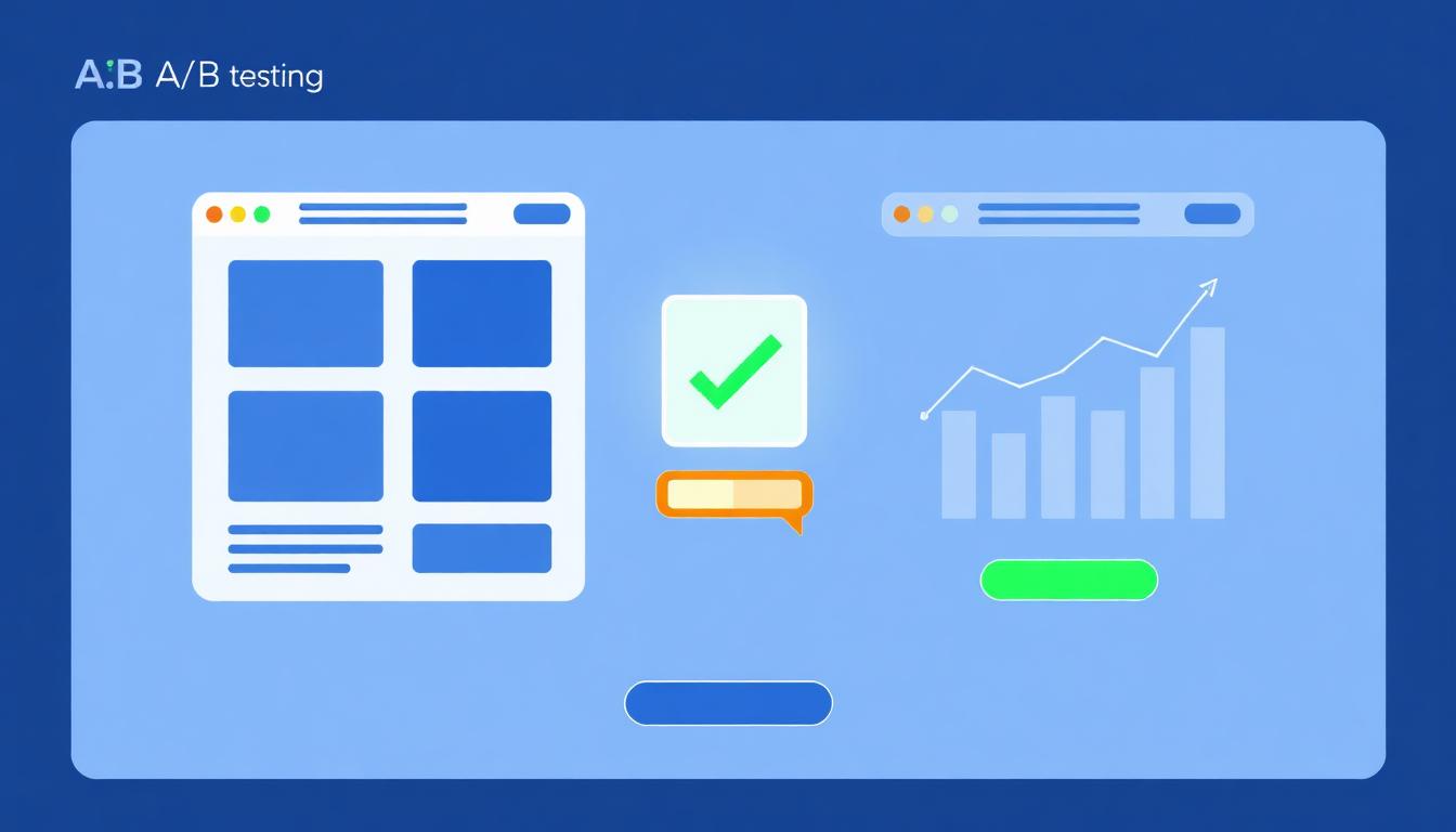
A/B testing is useful, but not while the form has nine fields. There's no point testing button shades before fixing what's obviously broken.
How we go about it:
- Fix the clear problems from the steps above.
- Test big hypotheses: a different value proposition, a different section order, pricing shown as “from” versus no pricing.
- One change per test, running long enough to gather enough conversions that the result isn't noise. On low-volume sites the honest conclusion is often that we can't test statistically, so we decide from recordings and customer conversations instead.
- Write down what was tested and when. Otherwise, six months later someone proposes the same idea again.
In short
There's nothing spectacular about CRO. Measure properly, fix the obvious friction, put proof where people hesitate, then test whatever is still unclear. On service websites this work usually pays off better than adding more ad budget on top of a page that doesn't convert anyway.
If you'd like a second opinion on your site, get in touch: we'll look at your analytics and a few recordings and tell you where enquiries are being lost and what we'd change first.
Want a website that brings in customers?
We'll give you a clear proposal, with price and delivery time, no obligations.
Related service
Business website design
See details and pricing
Written by
Andrei MunteanuHead of Development, RebeDesign
Builds the websites and online stores: speed, stability and an admin you can use without us.
Updated: 30 August 2026