
What a presentation website that actually brings in clients looks like in 2026
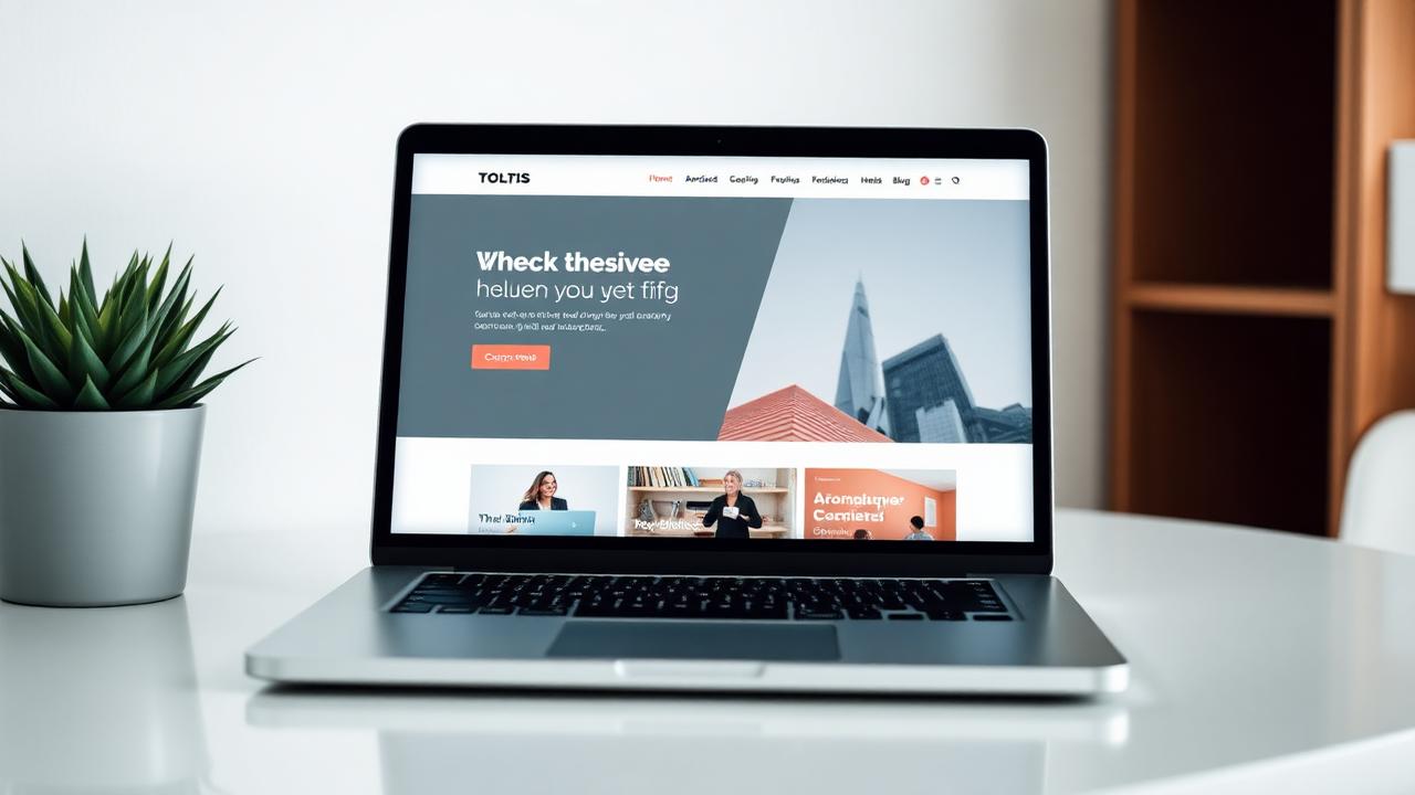
The structure we use for every project: what to put on the first screen, how many sections you need, and where most Romanian websites lose clients.
A beautiful website that doesn't generate quote requests is just an expense. In recent years, we've built dozens of websites for Romanian businesses, and the pattern repeats: the problem isn't the design, but the order of information.
1. The first screen decides everything
The visitor gives you 3-5 seconds. In that space, you need to answer three questions:
- What do you do? (one sentence, no filler words)
- For whom? (Bucharest, Cluj, nationwide, a specific industry)
- What do they do next? (a single main button: "Request a quote" or "Call now")
A classic mistake: a poetic slogan like "Innovative solutions for your future". It says nothing. Replace it with "We install air conditioning systems in Bucharest, within 48 hours".
2. The structure that works
The order we use for almost any presentation website:
- Hero with value proposition and CTA
- Trust bar (years of experience, projects, guarantees)
- Services, each with a concrete benefit
- Portfolio / real work, with proprietary photos
- Process in 3-4 steps, so people know what they're getting into
- Reviews with names and, ideally, photos
- Frequently Asked Questions (here you answer price objections)
- Short form + phone + WhatsApp
3. The form: fewer fields, more requests
Each additional field decreases the completion rate. Name, phone, a short description. You find out the rest by phone. If you need a budget, put it as options ("under €1,000", "€1,000-€3,000"), not as free text.
4. Speed is part of the design
A website that takes more than 3 seconds to load loses half its mobile traffic. Simple rules:
- images in modern format (WebP) and real dimensions, not 4000px scaled from CSS
- fonts: maximum two families
- no heavy sliders on the first screen
5. Mobile first, not "also on mobile"
Over 70% of our clients' traffic comes from mobile phones. Test with your thumb: large buttons, tappable phone number, WhatsApp just one click away.
Quick checklist before launch
- [x] A single main CTA, repeated 3-4 times
- [x] Titles that state benefits, not features
- [x] Real photos, not just stock
- [x] Legal pages (terms, privacy, cookies)
- [x] Google Analytics + Search Console connected
If you tick all the above boxes, you already have a better website than 80% of the competition. The rest is traffic — we'll talk about that in the other articles.
Want a website that brings in customers?
We'll give you a clear proposal, with price and delivery time, no obligations.
Related service
Business website design
See details and pricing
Written by
Andrei MunteanuHead of Development, RebeDesign
Builds the websites and online stores: speed, stability and an admin you can use without us.
Updated: 30 August 2026