
Three logo options and an indecisive client: how do we get unstuck?
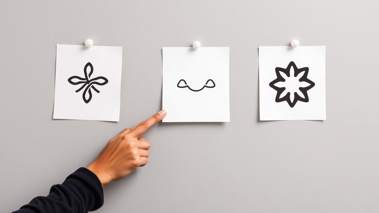
What do we do when none of the proposals are "the one", and why family opinions usually spoil the decision.
The most delicate moment in an identity project isn't the sketch. It's the meeting where the client looks at the options and says, "I don't know, I like them all," or, more often, "I showed them at home, and opinions are divided."
Why we never send options without context
A logo taken out of context looks like a drawing. And that's how it's judged: I like the shape, I don't like the colour. That's why we put each option on the things it will live on: a sign at the entrance, an invoice, a small profile picture, a black and white stamp, if applicable, the company car.
The difference is immediately clear. An option that looked best on a large screen failed with one client because, reduced to the size of a profile picture, the detail inside turned into a blur.
Questions that take the decision out of the realm of taste
We don't ask, "Which one do you like?" We ask:
- Which of them would look good next to competitors' logos, without getting lost?
- Which one would you be comfortable seeing unchanged in five years?
- Which one doesn't accidentally say something other than what you do?
The third question saved a project. The client's preferred symbol resembled, to an outsider, a recycling sign. The company had no connection to that field. We found this out because we showed the options to a few people who knew nothing about the company.
Family feedback
It's not useless, but it needs filtering. Family and friends respond to what they like, not to what the logo needs to do. When the client comes with a list of contradictory opinions, we ask for a single decision-maker. Without one, we end up with a compromise logo, where everyone got a small modification, and the result no longer resembles anything.
When none of them are good
It happens. Sometimes the brief was too broad, sometimes we misunderstood the direction. In this case, we don't add a fourth option on top of the existing ones – we go back to the direction discussion and restart with what we've learned from what the client rejected. Rejections say more than approvals.
How long it takes depends on how quickly we receive the decision. The drawing part is the shortest in the project.
If you need a logo and the files that go with it, tell us where it will be used in the first year, and we'll start from there.
What the option presentation looks like, in practice
We don't send a PDF and wait for an email response. We make a short call, share the screen, and keep the discussion focused on what the logo needs to do, not what we like. The table below shows what we present for each option.
| What we show | Why it matters in the discussion |
|---|---|
| The logo on a white background and on a dark background | Many options fail on a dark background, and this is only seen at implementation |
| Small version, favicon size | Fine details disappear, and the client sees the limitation themselves |
| On a real photo: sign, car, packaging | Takes the discussion out of the abstract |
| Black and white version | If it doesn't work without colour, the shape is weak |
| Next to two or three logos from the industry | Shows if we resemble someone too much |
What we do when the client wants a combination of two options
We ask them to choose the direction, not the elements. "The symbol from the first one with the font from the third" usually results in something that doesn't maintain the balance of either option. If they insist, we create the requested option and place it next to the original, in the same contexts. A couple of times, we were wrong, and the combination turned out better.
When we apply the brakes
If, by the second round, it's still not clear what the client wants, we stop and return to the brief. Usually, the problem isn't with the design, but with the fact that we haven't clearly established who the brand is for. There's no point in doing a third round based on the same confusion.
What you get at the end, so you don't get stuck
Editable files, options for light and dark backgrounds, small versions, and a short document with minimum spacing and colours. We don't deliver a forty-page brand manual for a logo, because nobody reads it. If you need a complete guide, that's a different project, and we'll mention it beforehand.
Do you have three options on the table and can't decide? Send them to us, and we'll tell you what questions we would ask before making a decision.
When we consider the subject covered
We don't have a good answer for all cases: with brands involving multiple decision-makers, the method above gets stuck, and we need to negotiate differently. We also made mistakes when we presented too many options, thinking we were helping – it only led to confusion and an extra round.
Not after ticking off a list, but after a simple question: if a new client were to ask about this tomorrow, would they find an answer here that would change their decision? If not, something is still missing, and it's usually a practical detail, not an entire section. We revisit texts after a few months when we see what people ask us on the phone and what wasn't written anywhere.
Want a website that brings in customers?
We'll give you a clear proposal, with price and delivery time, no obligations.
Related service
Logo & branding
See details and pricing
Written by
Diana PavelLead Designer, RebeDesign
Turns briefs into clear interfaces and visual identities designed for conversion, mobile first.
Updated: 3 September 2026